分隔线生成工具
形状
Waves
颜色
翻转
倒转
高度(px)
0px
500px
宽度(%)
100%
300%
https://spacexcode.com/shapedivider

介绍
在网页设计师的眼里不应该只有直线,那网页看起来实在太糟糕了!
当我们要在区块之间增加一条有弧度的曲线分隔线的时候,我们能想到的实现方式是什么?
上面的案例为我们提供了一个灵感,通过绘制一定路径的 SVG 并且设置背景色再重合在某个网页元素上而形成一个整体。
实现详解
就是下面的这样一个 SVG 图片,通过设置 width、height 和 fill 等属性,生成一个带曲线的有一定背景颜色的图片文件。
<svg preserveAspectRatio='none' width='1440' height='74' viewBox='0 0 1440 74' fill='#EFB354'>
  <path d='M456.464 0.0433865C277.158 -1.70575 0 50.0141 0 50.0141V74H1440V50.0141C1440 50.0141 1320.4 31.1925
    1243.09 27.0276C1099.33 19.2816 1019.08 53.1981 875.138 50.0141C710.527 46.3727 621.108 1.64949 456.464 0.0433865Z'>
  </path>
</svg>
形状的选择
这里的形状我做了一个字典映射
const shapeOptions = [
  { label: 'Waves', value: 'waves' },
  { label: 'Waves Opacity', value: 'waves-opacity'},
  { label: 'Curve', value: 'curve' },
  { label: 'Curve Asymmetrical', value: 'curve-asymmetrical'},
  { label: 'Triangle', value: 'triangle' },
  { label: 'Triangle Asymmetrical', value: 'triangle-asymmetrical' },
  { label: 'Tilt', value: 'tilt' },
  { label: 'Arrow', value: 'arrow' },
  { label: 'Split', value: 'split' },
  { label: 'Book', value: 'book' }
]
const shapePathMap = {
  waves: [{
    path: 'M321.39,56.44c58-10.79,114.16-30.13,172-41.86,82.39-16.72,168.19-17.73,250.45-.39C823.78,31,906.67,72,985.66,92.83c70.05,18.48,146.53,26.09,214.34,3V0H0V27.35A600.21,600.21,0,0,0,321.39,56.44Z',
    opacity: 1
  }],
  'waves-opacity': [{
    path: 'M0,0V46.29c47.79,22.2,103.59,32.17,158,28,70.36-5.37,136.33-33.31,206.8-37.5C438.64,32.43,512.34,53.67,583,72.05c69.27,18,138.3,24.88,209.4,13.08,36.15-6,69.85-17.84,104.45-29.34C989.49,25,1113-14.29,1200,52.47V0Z',
    opacity: 0.25
  }, {
    path: 'M0,0V15.81C13,36.92,27.64,56.86,47.69,72.05,99.41,111.27,165,111,224.58,91.58c31.15-10.15,60.09-26.07,89.67-39.8,40.92-19,84.73-46,130.83-49.67,36.26-2.85,70.9,9.42,98.6,31.56,31.77,25.39,62.32,62,103.63,73,40.44,10.79,81.35-6.69,119.13-24.28s75.16-39,116.92-43.05c59.73-5.85,113.28,22.88,168.9,38.84,30.2,8.66,59,6.17,87.09-7.5,22.43-10.89,48-26.93,60.65-49.24V0Z',
    opacity: 0.5
  }, {
    path: 'M0,0V5.63C149.93,59,314.09,71.32,475.83,42.57c43-7.64,84.23-20.12,127.61-26.46,59-8.63,112.48,12.24,165.56,35.4C827.93,77.22,886,95.24,951.2,90c86.53-7,172.46-45.71,248.8-84.81V0Z',
    opacity: 1
  }],
  curve: [{
    path: 'M0,0V7.23C0,65.52,268.63,112.77,600,112.77S1200,65.52,1200,7.23V0Z',
    opacity: 1
  }],
  'curve-asymmetrical': [{
    path: 'M0,0V6c0,21.6,291,111.46,741,110.26,445.39,3.6,459-88.3,459-110.26V0Z'
  }],
  triangle: [{
    path: 'M1200 0L0 0 598.97 114.72 1200 0z'
  }],
  'triangle-asymmetrical': [{
    path: 'M1200 0L0 0 892.25 114.72 1200 0z'
  }],
  tilt: [{
    path: 'M1200 120L0 16.48 0 0 1200 0 1200 120z'
  }],
  arrow: [{
    path: 'M649.97 0L550.03 0 599.91 54.12 649.97 0z'
  }],
  split: [{
    path: 'M0,0V3.6H580.08c11,0,19.92,5.09,19.92,13.2,0-8.14,8.88-13.2,19.92-13.2H1200V0Z'
  }],
  book: [{
    path: 'M1200,0H0V120H281.94C572.9,116.24,602.45,3.86,602.45,3.86h0S632,116.24,923,120h277Z'
  }],
  'waves-invert': [{
    path: 'M985.66,92.83C906.67,72,823.78,31,743.84,14.19c-82.26-17.34-168.06-16.33-250.45.39-57.84,11.73-114,31.07-172,41.86A600.21,600.21,0,0,1,0,27.35V120H1200V95.8C1132.19,118.92,1055.71,111.31,985.66,92.83Z'
  }],
  'curve-invert': [{
    path: 'M600,112.77C268.63,112.77,0,65.52,0,7.23V120H1200V7.23C1200,65.52,931.37,112.77,600,112.77Z'
  }],
  'curve-asymmetrical-invert': [{
    path: 'M741,116.23C291,117.43,0,27.57,0,6V120H1200V6C1200,27.93,1186.4,119.83,741,116.23Z'
  }],
  'triangle-invert': [{
    path: 'M598.97 114.72L0 0 0 120 1200 120 1200 0 598.97 114.72z'
  }],
  'triangle-asymmetrical-invert': [{
    path: 'M892.25 114.72L0 0 0 120 1200 120 1200 0 892.25 114.72z'
  }],
  'arrow-invert': [{
    path: 'M649.97 0L599.91 54.12 550.03 0 0 0 0 120 1200 120 1200 0 649.97 0z'
  }],
  'split-invert': [{
    path: 'M600,16.8c0-8.11-8.88-13.2-19.92-13.2H0V120H1200V3.6H619.92C608.88,3.6,600,8.66,600,16.8Z'
  }],
  'book-invert': [{
    path: 'M602.45,3.86h0S572.9,116.24,281.94,120H923C632,116.24,602.45,3.86,602.45,3.86Z'
  }]
}
将当前选择的形状对应的 Key 值和 shapePathMap 中的属性做匹配,找到对应的 path 数组渲染到页面。
export default function Form () {
  // ...
  return (
    <div
      className='shapeDivider'
      style={{transform: formData.invert ? 'rotate(180deg)' : 'none'}}>
      <svg
        xmlns='http://www.w3.org/2000/svg' viewBox='0 0 1200 120'
        preserveAspectRatio='none'
        id='divider'
        style={{
          width: 'calc(' + formData.width + '% + 1.3px)',
          height: formData.height + 'px',
          transform: formData.flip ? 'rotateY(180deg)' : 'none'
        }}>
          {
            shapePathMap[mapKey].map((el, index) => (
              <path
                key={index}
                d={el.path}
                style={{fill: formData.color}}
                opacity={el.opacity}
                className='shape-fill'>
              </path>
            ))
          }
      </svg>
    </div>
  )
}
翻转和倒转
翻转
有的形状倒转的情况下是使用了不同的 SVG 路径,然后对整个 SVG 图片做 180 度旋转。使用的是 CSS 属性 transform: rorate(180deg)。
倒转
而翻转则是直接对 SVG 图片在 Y 轴上做 180 度旋转,添加样式 transform: rotateY(180deg)。
背景图片切换
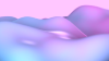
为了演示效果,这里添加了背景图片的切换功能,从开放图片分享网站 Unsplash 上找��了这么四张代表性的图片。尽量使用色彩丰富一点的图片,效果会更好。


下载图片
从页面中获取 SVG 图片的代码生成文件流,然后通过 window 对象的 URL 属性的 createObjectURL 方法生成文件的地址,最后通过 a 标签去下载。
const downloadSvg = () => {
  const svgBlob = document.querySelector('#divider').outerHTML;
  var blob = new Blob([svgBlob], { type: 'image/svg' });
  var href = window.URL.createObjectURL(blob);
  var a = document.createElement('a');
  a.style.display = 'none';
  a.href = href;
  a.download = 'shapedivider-' + formData.shape + '.svg';
  a.rel = 'noopener noreferrer';
  document.body.appendChild(a);
  a.click();
  setTimeout(() => {
    a.remove();
  }, 1000);
  URL.revokeObjectURL(href);
}
总结
这个简单的项目主要在于行内样式的写法,以及对 SVG 路径知识的灵活运用。