文档的实现
文档功能由插件 plugin-content-docs 提供支持。它也是 Docusaurus 的默认插件。所以你创建的应用默认包含文档功能。
创建文档
项目根目录下的 docs 为存放文档的目录,你可以直接在里面创建 md 或 mdx 文件,也可以新建子目录以更多维度地组织你的文档。
docs # 文档根目录
├── javascript
│   └── example.md
├── css
│   └── index.mdx
├── intro.mdx
├── ...
文档目录下所有以 _ 前缀来命名的文件都会被视为局部的文件,不会渲染成新的页面。
这种局部文件的使用方式:
import PartialExample from './_markdown-partial-example.mdx';

<PartialExample name="Sebastien" />
文档的访问链接
文档的访问链接默认是根据你文件的存放路径来的,比如:
| 路径 | 访问链接 |
|---|---|
| docs/intro.mdx | http://域名/docs/intro |
| docs/javascript/example.md | http://域名/docs/javascript/example |
如果你不想直接用文件名来作为访问链接的最后部分,你需要在文档的导言的 id 字段中定义:
---
id: my-first-doc
title: 一篇包含标签的文档
description: 文档的描述文字
---
或者你想在链接中直接跳过目录,还有一个 slug 字段。比如 docs/css/guide.mdx
---
id: guide
title: 一篇包含标签的文档
slug: /
---
则该文档的访问链接为 http://域名/docs/guide
侧边栏
文档的侧边栏配置文件为项目根目录下的 sidebars.js 文件,然后通过 docusaurus.config.js 配置文件中的 sidebarPath 属性进行挂载。
module.exports = {
  // ...
  presets: [
    [
      {
        docs: {
          sidebarPath: require.resolve('./sidebars.js'),
        }
      }
    ]
  ]
}
下面以当前站点为例,导航中的“知识库”、“代码片段”和“专题”分别对应三个文档。它们分别有自己对应的侧边栏,在配置文件中有三个分类:knSidebar,
snipSidebar,topicSidebar。
文档存放目录结构:
docs # 文档根目录
├── javascript
│   └── example.md
├── css
│   └── index.mdx
├── snippet # 代码片段目录
│   └── component
│       └── index.mdx
├── topic # 专题目录
│   └── docusaurus
│       └── some.mdx
├── ...
对应侧边栏配置
const sidebars = {
knSidebar: [ // 知识库
'index',
{
type: 'category',
label: 'JavaScript',
items: [
{
type: 'autogenerated',
dirName: 'javascript'
}
],
link: {
type: 'generated-index',
title: 'JavaScript',
description: 'JavaScript(JS)是一种具有函数优先特性的轻量级、解释型或者说即时编译型的编程语言。',
slug: '/javascript',
keywords: ['JavaScript', '前端', '浏览器'],
}
},
{
type: 'category',
label: 'CSS',
items: [
{
type: 'autogenerated',
dirName: 'css'
}
]
},
{
type: 'category',
label: 'NodeJS',
items: [
{
type: 'autogenerated',
dirName: 'nodejs'
}
]
},
'typescript',
'framework',
{
type: 'category',
label: 'Vue',
items: [
{
type: 'autogenerated',
dirName: 'vue'
}
],
link: {
type: 'generated-index',
title: 'Vue',
description: '渐进式JavaScript 框架,易学易用,性能出色,适用场景丰富的 Web 前端框架。',
slug: '/vue',
keywords: ['渐�进式', '框架', '响应式'],
}
},
{
type: 'category',
label: 'React',
items: [
{
type: 'autogenerated',
dirName: 'react'
}
]
},
{
type: 'category',
label: '工程化',
items: [
{
type: 'autogenerated',
dirName: 'workflow'
}
]
},
{
type: 'category',
label: '服务器',
items: [
{
type: 'autogenerated',
dirName: 'server'
}
]
},
{
type: 'category',
label: '整理合集',
items: [
{
type: 'autogenerated',
dirName: 'collection'
}
]
},
{
type: 'category',
label: '在线演示',
items: [
{
type: 'autogenerated',
dirName: 'demo'
}
]
},
{
type: 'category',
label: '资源',
items: [
{
type: 'autogenerated',
dirName: 'source'
}
]
}
],
snipSidebar: [ // 代码片段
'snippet/intro',
{
type: 'category',
label: '小功能',
items: [
{
type: 'autogenerated',
dirName: 'snippet/function'
}
],
link: {
type: 'generated-index',
title: '小功能',
description: '小功能,大用处。',
slug: '/snippet/function',
keywords: ['小功能', '封装', '常用函数'],
}
},
{
type: 'category',
label: '小组件',
items: [
{
type: 'autogenerated',
dirName: 'snippet/component'
}
],
link: {
type: 'generated-index',
title: '小组件',
description: '收集制作的一些小组件,有的已经在本站中使用。',
slug: '/snippet/component',
keywords: ['组件', '封装', '常用函数'],
}
},
{
type: 'category',
label: '钩子函数',
items: [
{
type: 'autogenerated',
dirName: 'snippet/hooks'
}
],
link: {
type: 'generated-index',
title: '钩子函数',
description: '常用的封装好的 hooks,拿来即用。',
slug: '/snippet/hooks',
keywords: ['钩子', '封装', 'Hook'],
}
},
{
type: 'category',
label: '小程序',
items: [
{
type: 'autogenerated',
dirName: 'snippet/program'
}
],
link: {
type: 'generated-index',
title: '小程序',
description: '用代码实现某个特定功能的或解决某个特定问题的小程序,从某种意义上说就是一个软件产品。',
slug: '/snippet/program',
keywords: ['程序', '功能', '解决方案'],
}
},
],
topicSidebar: [ // 专题
'topic/intro',
{
type: 'category',
label: 'Docusaurus',
items: [
{
type: 'autogenerated',
dirName: 'topic/docusaurus'
}
]
},
{
type: 'category',
label: 'Next.js',
items: [
{
type: 'autogenerated',
dirName: 'topic/nextjs'
}
]
}
]
}
隐藏侧边栏
有的时候你可能需要暂时收起侧边栏,将视线集中在内容区域。配置 sidebar 参数的 hideable 属性,该值默认为 false ,当设置为 true 时,这时侧边栏下面会出现一个向左
的箭头按钮。该按钮实现侧边栏的收起功能。
module.exports = {
  themeConfig: {
    docs: {
      sidebar: {
        hideable: true,
      },
    },
  },
};
侧边栏的展开方式
当你的文档侧边栏层级过多,为了关注选定的部分,免于打开过多的菜单,当我们打开一个同级下的一个菜单,其它菜单会收起。
module.exports = {
  themeConfig: {
    docs: {
      sidebar: {
        autoCollapseCategories: true,
      },
    },
  },
};
侧边栏默认展开
侧边栏默认是折叠状态,但可以通过参数设置进入文档,及展开某个侧边栏项,也可通过全局参数设置所有的文档侧边栏项初始就是展开的状态。
先说全局设置:
export default {
  presets: [
    [
      '@docusaurus/preset-classic',
      {
        docs: {
          sidebarCollapsed: false,
        },
      },
    ],
  ],
};
再说局部对某个侧边栏项:
topicSidebar: [
  {
    type: 'category',
    label: 'Docusaurus',
    collapsed: false,
    items: [
      {
        type: 'autogenerated',
        dirName: 'topic/docusaurus'
      }
    ]
  }
]
以上两种只是将侧边栏菜单设置成默认展开状态,右侧的折叠操作按钮仍然存在。还有一种设置选项是将菜单设置成不可折叠的状态,及永远是展开状态,操作按钮都不存在了。
topicSidebar: [
  {
    type: 'category',
    label: 'Docusaurus',
    collapsible: false,
    items: [
      {
        type: 'autogenerated',
        dirName: 'topic/docusaurus'
      }
    ]
  }
]
注意:开发环境下修改侧边栏配置文件
sidebars.js后需要重启才能看到效果。
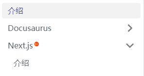
传递自定义参数
如果我们想更多地定制侧边栏的功能和样式,就需要从侧边栏的配置文件中传递参数,然后通过 Swizzle 侧边栏组件,进行改造。比如这样一个常见的功能,给某个文档“标新”操作,即在
菜单右上角显示 new 标识。
{
  type: 'category',
  label: 'Next.js',
  items: [
    {
      type: 'autogenerated',
      dirName: 'topic/nextjs',
    }
  ],
  customProps: {
    featured: true
  }
};
执行 Swizzle 安装命令
npm run swizzle @docusaurus/theme-classic DocSidebarItem --eject
这时在 src/theme 目录下生成 DocSidebarItem 目录,我们编辑 Category/index.js 文件
在原来的 155 行修改
-- {label}
++ {label}
++ { customProps && customProps.featured ?
++      <sup><img src='/img/new.png' width='10'style={{ verticalAlign: 'top', marginLeft: '2px' }} /></sup> : '' }
最终的效果: